A Comprehansive Guid to React Native Elements
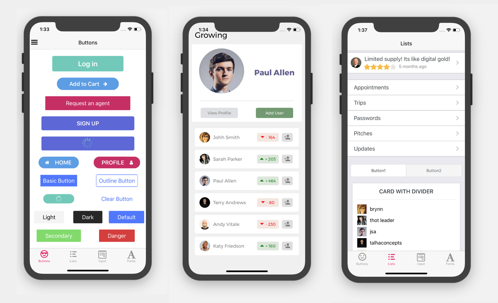
React Native Elements (RNE) are a cross-platform user interface toolkit. These elements may now be utilised on the web, and your codebase can be shared between both React Native and React web projects. On the browser, the components of react-native elements are rendered flawlessly. After collaborating with React Native for Web and RNE, you may utilise these components to target Android, iOS, and the web.
It is a framework for styling React applications. It includes built-in components that replace React Native’s basic components. Elements’ styles are incredibly adaptable and can be adjusted to meet our specific requirements. Every component in Elements has a React Native <View/> component, and the style is done according to the properties specified.
The react-native elements’ objective is to provide a comprehensive UI kit for creating react native apps. There are various great UI components created by developers in open-source. Furthermore, react-native elements make the process of putting together React packages easier by providing a ready-made kit with a dependable API, look, and feel.
Some of the most commenly used React Native Elements are as follows:-
Avtars
Avatars appear frequently in the UI design. You may find them everywhere in the UI design, from lists to profile panels. These elements are commonly used to represent a user. Icons, photographs, and text can all be included.
Badges
Badges are little components that are commonly used to communicate a numeric value to the user or to indicate the state of a certain object.
The small badge is one of the most common varieties of badge. When no value prop is specified, it enters the picture. Furthermore, it is quite excellent in representing different statuses. As can be seen in the diagram above, each hue represents a different badge.
Button
Buttons have a reputation for promoting screen interaction. They’re touchable elements that can show icons, text, or both at the same time. They may be styled with a variety of objects to make them stand out.
ButtonGroup
ButtonGroup is a set of sections that runs in a straight line. Each ButtonGroup acts as a button that can show a different view. A ButtonGroup can be used to present choices that are closely related yet mutually incompatible.
With React and Tailwind CSS, how do you make a ButtonGroup Component? - Developers’ Community
Bottom Sheet
A Bottom Sheet is an overlay modal that displays content from the bottom portion of the screen.
CheckBox
CheckBoxes allow users to complete tasks that need them to make decisions. The options can be selected or the settings can be turned on and off. Furthermore, it provides a clear visual representation of whether the choice is true or incorrect. Whichever React training method you choose, knowing these components is essential.
Card
Cards are a great method to display information. They usually consist of content and behaviours related to a specific topic. Cards can also incorporate text, buttons, photos, and other elements.
Divider
The usage of separators to visually separate the material is common. When you want to draw a separation between different portions of material, you can use a divider.
FAB (Floating Action Button)
Button with a Floating Action
A floating action button (FAB) moves across the screen and performs the principal or most familiar action. This element appears in the foreground of all screen content. It is usually available in a circular shape with a symbol in the centre.
Header
Headers are essentially navigation elements that display information and actions relevant to the current screen.
The heading in the graphic above is ‘My History,’ and it contains a menu underneath it that prompts you with appropriate options. The following are some examples of how headers are commonly used:
Default components in the header
Custom components are passed in via props in the header.
Custom components are sent in as children in the header.
The centre component is positioned to the left.
Mixture of components in the header
Customizable headers
Priority of components
Headings in HTML format (Text)
Characters and words of various sizes are featured in the text. In the React tutorial, a simple sample of HTML style heads can be seen, with each text readily identifiable.
Icon
Icons are the greatest choice for graphically indicating or describing purpose or activity.
The react-native-vector-icons package is used to create icon sets in React Native Elements.
The following are the icon sets that are accessible in React Native Elements:
- antdesign
- evilicon
- entypo
- font-awesome
- font-awesome-5
- feather
- fontisto
- foundation
- material
- material-community
- ionicon
- octicon
- simple-line-icon
- zocial
Image
The images component is a drop-in replacement for the React Native Image component. They include graphics as well as a placeholder and smooth image transitions.
Input
These components, which look like forms or dialogues, allow users to enter text into a user interface.
Labels and icons are used to input data.
ListItem
ListItem is the appropriate component for displaying rows of information. They show rows of data such as a menu, a playlist, or a contact list. They can include symbols, badges, avatars, switches, and more, and are highly configurable.
When you hover your mouse over each of the choices in the image above, you’ll see a drop-down menu appear.
Overlay
The Overlay is a view that floats above an app’s content. In general, overlays are simple methods of notifying or requesting information from the user.
Linear Progress
Users can see the status of ongoing processes thanks to these components. They employ progress markers to show how far they’ve come. They show states such as form submission, programme loading, and saving updates, among others. They also reflect accessible actions, such as whether a user may navigate away from the current screen, and express the status of an app.
Rating
Ratings are a good way to get quantitative input from users. The user involvement is boosted by the clear pictures and rating indicators. Knowledge of such components is required when preparing for the React Interview Questions and Answers.
Pricing
These components provide a great deal of ease to the user by displaying features and pricing. They present pricing information in a visually appealing manner.
The pricing component, for example, is depicted in the diagram above. It specifies the price as well as the features included in the specific bundle.
SearchBar
SearchBars can be used to filter or search for objects. When the amount of objects directly effects a user’s ability to find one among them, you can utilise a SearchBar.
DigitalOcean takes a look at the React Native Elements UI Toolkit.
The following are examples of searchbars:
- Default SearchBar
- SearchBar that is specific to a platform (iOS and Android)
SocialIcon
SocialIcons are graphic representations of internet and social media networks.
Native React Example Tutorial: Create a Beautiful Social Icons Button Using React Native Elements
Slider
You may easily select a value from the available alternatives using this component. Furthermore, this component is regarded as a forked version of react-native-slider.
Switch
It tells if a certain condition is active or not. This component is utilised when the need to indicate the user’s decision occurs. A switch is a controlled component that renders a boolean value and requires a onValueChange to update the value prop. React native elements provide you with an extra theme and colour support via the Switch Button.
Speed Dial
A floating action button can show 3 to 6 actions as speed dial when Speed Dial is pressed. You can use something other than an FAB if you need more than six actions. When the FAB is pressed, it remains visible and generates a stack of activities. If the FAB is tapped in this condition, it must either perform its default action or disable the speed dial functions.
Tabs
Tabs organise content across many displays, data sets, and a few other interactions in a logical way. The content of the’recent, favourite, and cart’ choices is neatly organised in the diagram below.
TabView
The following is a list of the Props available in this component:
- value
- onChange
- animationConfig
- animationType
Tile
Tiles, like cards, are a simple way to display pertinent content about a single topic. Tiles can be utilised in a variety of ways, including:
- Tile of the Week
- Tile with an Icon as a Featured Item
- Tile with a symbol
Tooltip
When users hover their cursor over an element, tooltips appear.


Use the share button below if you liked it.
It makes me smile, when I see it.